
Buddhist Painting Color Palette: Warm and Cool Tones
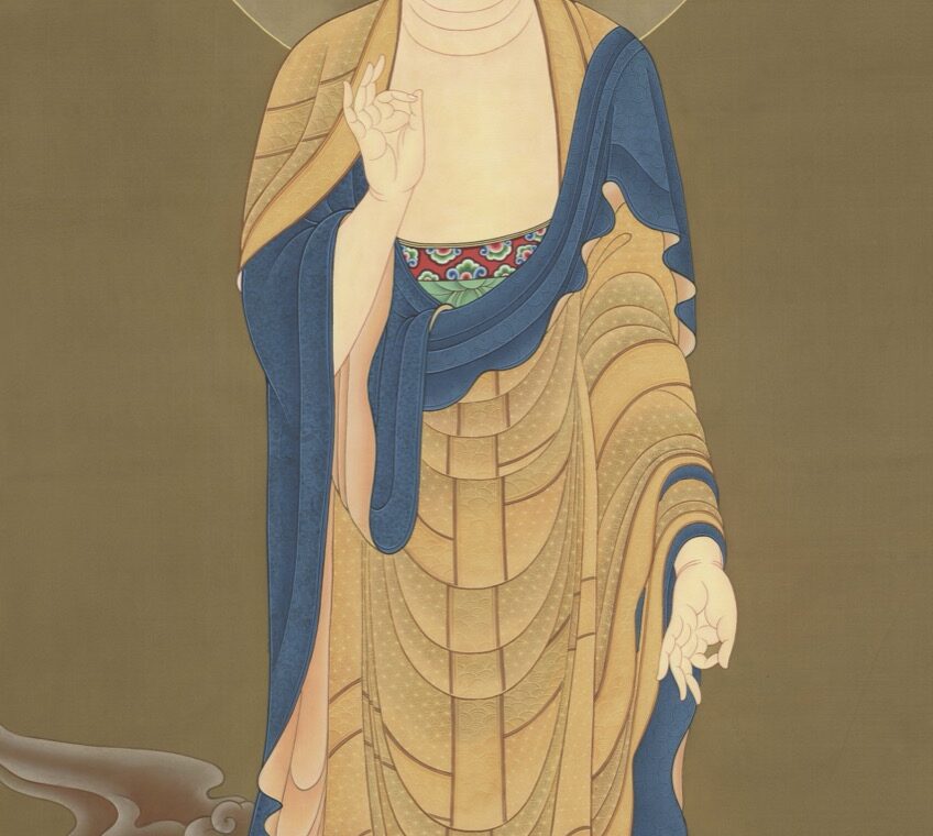
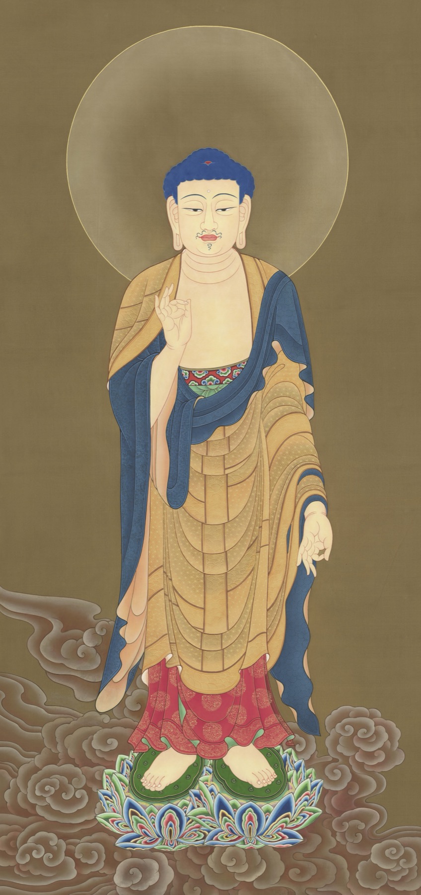
A Buddhist painting color palette is easiest to read as a set of relationships, not a dictionary in which each hue has one fixed meaning. In TANGKAWORLD archive image TK1110, warm gold and peach robe areas sit beside a cool blue mantle; red and green details punctuate the lotus base, while patterned clouds frame the lower figure. This visual guide records what those colors do in the composition without using them alone to identify the figure, date the work, or assign it to a school.
The method is useful for Thangka study and for Buddhist paintings more broadly: first describe the visible evidence, then ask how color guides attention, separates forms, and organizes space. For a wider framework, see our step-by-step guide to reading a Thangka.
What “warm and cool” means when looking at a painting
Warm and cool are practical descriptions of how colors appear in relation to nearby colors. Gold, ochre, orange, and peach often feel warm; blues often feel cool. These labels describe perception, not an automatic Buddhist code. A blue can feel warmer beside a much darker blue, and a yellow can appear cooler beside a vivid orange. The comparison depends on neighboring hues, brightness, saturation, and the light in which the image is viewed.
In TK1110, the gold-peach robe occupies a broad central area, so it carries much of the figure’s visual weight. The blue mantle forms a strong, cooler shape along the sides and across the torso. Red and green occur in smaller, more saturated patches near the lower edge. The palette therefore has two systems at once: large areas establish the overall balance, while small accents attract the eye through contrast.
Color also works with outline and shape. The blue fabric is not noticed only because it is blue; its dark edge against a lighter robe makes the drape legible. Repeated curved gold bands describe overlapping robe sections. Green supports and lotus forms repeat near the base, connecting details that are separated by the red panels. Looking at color together with contour prevents a palette description from becoming a list of isolated names.
TK1110: a close-reading case study
The archive filename associates TK1110 with a Western Pure Land group and Amitabha, but that label is not independently verified here. The visible reproduction shows one standing, haloed figure in layered robes above a patterned lotus base and clouds. The identity, original grouping, maker, date, school, collection history, and provenance remain uncertain. That uncertainty makes the image a useful case for separating visual analysis from attribution.
Begin with the largest color fields
First, compare the warm robe with the blue mantle. The robe’s gold and peach areas are segmented by fine, curved lines; the blue fabric reads as a more continuous outer shape. This difference in shape and value can make the mantle appear especially prominent even though it covers less of the figure. Record the actual locations rather than simply saying that the painting is “blue and gold.”
Then follow the accents downward
The red panels and green lotus structures sit near the bottom, where they create a compact zone of stronger color. The clouds use softer, related tones and curved outlines, so they support the base rather than compete with the head and halo. This path—from face and halo, through robe and mantle, to lotus and clouds—shows how color can guide a viewer through a tall composition. It does not establish that a particular hue names the central figure.
A repeatable sequence for reading a Buddhist painting color palette
1. Map the dominant areas. Note the largest color fields first: background, halo, main garment, secondary drape, seat, and landscape. Estimate where each begins and ends. Do not start by assigning symbolism.
2. Compare neighboring colors. Ask which fields feel warmer or cooler beside one another, and whether the difference comes from hue, brightness, saturation, or all three. In TK1110, compare blue cloth with gold-peach cloth, then compare the gold with the red and green accents.
3. Track edges and repetition. Observe where outlines divide fabric, where a hue repeats, and whether repeated colors connect distant objects. Compare the bands and overlaps with our guide to layered garments in Buddhist art.
4. Separate observation from interpretation. Write “blue mantle beside gold robe” as an observation. Write “the blue identifies a deity” only if a reliable textual, ritual, or comparative source supports that specific claim. If the evidence is absent, leave the identification uncertain.
Quick checklist for color-focused viewing
- Which three colors occupy the largest areas?
- Where do warm and cool colors touch, and what contour separates them?
- Are the strongest accents near the face, hands, seat, or border?
- Does a hue repeat in the halo, garment, lotus, or landscape?
- Could the apparent contrast be intensified by lighting, photography, or a screen?
- Which observations are visible, and which conclusions need outside evidence?
This checklist can also improve image descriptions. Our practical guide to Buddhist-art alt text explains how to describe visible colors and forms while keeping uncertain identities uncertain.
Color symbolism needs a specific context
Color can carry doctrinal or ritual meaning, but that meaning should be tied to a particular figure, text, composition, or tradition. The Asian Art Museum’s educational overview notes that traditional Thangka materials and embellishment depended partly on the patron’s resources, and its teaching materials describe colors as governed by rules and customs in some traditional painting contexts. Those observations are not a license to assign one universal meaning to every instance of blue, gold, red, or green.
Specific museum records show why context matters. The Metropolitan Museum describes its 1777 image of Śikhin as gold on indigo-dyed paper, explaining how the work translates a stark black-and-white visual idiom into a different palette. The Rubin Museum’s discussion of red, black, and gold solid-ground paintings likewise describes artists varying color and tonal washes to shape volume and expression. These are documented examples, not templates that can be imposed on TK1110.
Likewise, a color association used in one iconographic system should not be transferred automatically to another. When an image’s identity is established by inscriptions, attributes, or a well-documented group, color may reinforce the reading. When those anchors are missing, color is best treated as one clue among several. Our article on Amitabha and Amitayus visual clues discusses why attributes and compositional context matter more than a single surface feature.
Reproduction and condition can change what you see
A digital image is not the painting itself. White balance, exposure, compression, display settings, and the original lighting can shift how gold, blue, and red appear. A photographed metallic surface may lose the changing reflection that would be visible in person. Aging, fading, abrasion, retouching, or a later repair may also alter a hue or its boundaries. For TK1110, the current reproduction supports a descriptive palette reading; it does not establish the original pigments or condition history.
For careful comparison, use the same image version and note its source. If color is central to a research question, compare multiple photographs, check a museum or collection record, and avoid editing the file in ways that alter hue or contrast. A conservation record should distinguish visible discoloration from a confirmed material change. This is especially important when comparing images from different websites or devices.
What this palette can—and cannot—tell you
TK1110’s warm gold robe, cool blue mantle, red-green lotus accents, and patterned clouds create a clear visual rhythm. They help the viewer distinguish overlapping forms, move through the vertical composition, and notice the balance between broad fields and small accents. That is already a substantial reading. The palette alone cannot confirm the central figure’s identity, the archive title, date, artist, school, original grouping, or provenance. Record the visible evidence first, then state only what the supporting sources allow.
Download the full Thangka image collection
Continue exploring and download the complete TANGKAWORLD image collection from the free downloads page.