
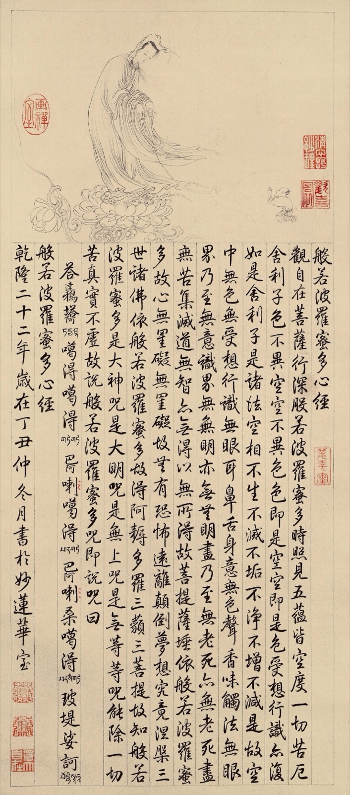
Heart Sutra calligraphy can be read as both sacred text and visual design. In TK0259, a lightly drawn Bodhisattva occupies the upper part of the sheet, while the scripture unfolds below in disciplined vertical columns. Red seals interrupt the black ink at carefully spaced points, and a narrow inscription column runs along the left edge. The result is not simply a page of writing: text, image, empty paper, seals, and colophon form one Buddhist artwork.
The archive filename identifies TK0259 as a Qing-dynasty work associated with Qianlong imperial writing. That record is useful, but an image alone cannot authenticate the handwriting, seals, date, authorship, or provenance. This guide therefore concentrates on visible evidence and treats the exact attribution, workshop history, ownership, and conservation record as uncertain unless supporting documentation is available.
What makes Heart Sutra calligraphy a Buddhist artwork?
The Heart Sutra belongs to the Prajnaparamita, or “Perfection of Wisdom,” tradition. Its compact text is closely associated with the teaching that phenomena are empty of fixed, independent existence. When the sutra is copied by hand, the act of writing can combine reading, devotion, discipline, and aesthetic judgment. The completed sheet preserves the words, but it also records pace, pressure, spacing, and the writer’s physical movement.
That dual function distinguishes Buddhist calligraphy from an ordinary transcription. A reader follows the scripture line by line, while a viewer sees rhythm across the entire surface. Dense black characters may be balanced by open paper; seals may stabilize a corner; and a sacred figure may introduce the text without illustrating every sentence. For related wisdom imagery, compare the Prajnaparamita Thangka guide, where the book itself becomes a visual attribute.
How to read TK0259 from top to bottom
Begin with the Bodhisattva image
The upper register contains a standing, robed figure drawn with fine ink lines. The figure inclines the head and stands above an elaborate lotus support. Long drapery folds flow diagonally toward the right, softening the otherwise upright format. The archive title calls the subject a “great being,” but the exact iconographic form should remain uncertain without a fuller inscription study or catalogue record.
The image nevertheless performs a clear structural role. It establishes a devotional focus before the reader reaches the scripture. It also creates a contrast between pictorial line and written line: curved contours describe the body and robes, while repeated vertical strokes organize the text below. Readers interested in the variety of compassion imagery can compare the treatment with the Water-Moon Avalokiteshvara mural guide, without assuming that the two works show the same form.
Follow the vertical text columns
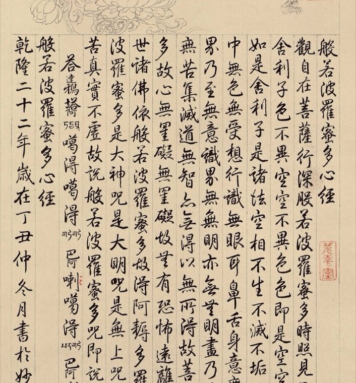
The main block is written in traditional vertical columns, read from top to bottom and ordered from right to left. Ruled lines keep the columns separate but do not make the writing mechanical. Character size, ink density, and spacing vary subtly, giving each column its own pulse while preserving the overall rectangle.
When examining a high-resolution image, first identify the beginning and end of the main text before trying to read seals or marginal notes. Look for shifts in character size, spacing, or alignment that may signal a title, scripture body, mantra, dedication, date, or signature. Do not assume that every visible mark belongs to the sutra itself. Later owners, cataloguers, or mounting specialists may have added seals and notes at different times.
Compare calligraphic rhythm, not isolated characters
One character can be distorted by paper movement, ink spread, restoration, photography, or compression. A more reliable visual reading compares repeated features across many lines: the angle of descending strokes, the balance between thick and thin marks, the amount of white space inside characters, and the way one character leads into the next.
In TK0259, the writing is clear and upright but not rigid. Some strokes broaden at turns; others taper quickly. The regular columns provide order while the brushwork retains visible variation. These differences are evidence of execution, not automatic proof of a named hand. Authentication requires comparison with securely documented works, seal research, paper analysis, and provenance.
What the red seals can and cannot tell us
Several red impressions appear across the sheet: one near the upper image, a group at upper right, another beside the scripture block, and additional seals at lower left. Their color creates visual anchors and may record ownership, appraisal, institutional control, or a maker’s identity. Placement matters because a seal over a seam or close to a colophon may relate to a different stage in the object’s history than a seal placed prominently beside the image.
Yet a seal is not self-verifying evidence. Impressions can be copied, reapplied, misread, or added long after a work was made. A responsible record should note shape, position, color, legibility, and any overlap before proposing an owner or date. The separate guide to Buddhist painting seals and collector marks explains why seal evidence must be combined with inscriptions, materials, and documented custody.
A practical Heart Sutra calligraphy checklist
- Record the whole sheet: Note orientation, overall proportions, borders, image area, text block, colophon, and seal locations.
- Separate content zones: Distinguish the main sutra from titles, mantras, dedications, dates, signatures, and later annotations.
- Confirm reading order: For this layout, follow each column downward and move from right to left.
- Describe the script: Record size, regularity, stroke weight, spacing, corrections, and ink changes without assigning a famous hand too quickly.
- Map every seal: Photograph or crop each impression and note whether it overlaps text, image, border, or another seal.
- Inspect the support: Look for paper joins, creases, stains, losses, retouching, repairs, and changes in tone.
- Keep uncertainty visible: Separate what the image shows from what the filename, catalogue, or tradition claims.
Paper, condition, and digital viewing
The warm paper tone in TK0259 is not enough to determine age. Lighting, white balance, storage, staining, and digitization can all change apparent color. Fine horizontal lines, subtle creases, uneven margins, and variations around seals deserve closer inspection, but they should be described before they are interpreted.
Use the full image to understand composition, then zoom in for brush edges, seal impressions, paper fibers, and possible repairs. Avoid judging stroke quality from a thumbnail because resizing can merge dry-brush texture and soften ink boundaries. The guide to studying Buddhist art with high-resolution images offers a repeatable method for moving between full composition and small details.
Common attribution mistakes
The most common error is turning a descriptive filename into a proven attribution. “Qing dynasty” and “Qianlong imperial writing” may reflect an archive record, an inscription, a previous owner’s opinion, or established scholarship; the digital image does not reveal which. The second error is treating all red seals as contemporary with the writing. The third is identifying the upper figure from posture alone without checking inscriptions and comparative iconography.
A sound description can still be useful without resolving every question. It can state that the sheet combines a line-drawn Bodhisattva, vertical Heart Sutra calligraphy, multiple red seals, ruled columns, and a left colophon. It can then mark the exact date, author, seal owners, paper type, mounting history, and provenance as uncertain. This distinction makes the record more reliable for future research.
Conclusion
Heart Sutra calligraphy should be read at three scales: the complete relationship between image and text, the rhythm of columns and seals, and the fine evidence of individual strokes and paper condition. TK0259 demonstrates how a short scripture can become a carefully organized Buddhist artwork. Its visual features are clear, while its precise authorship and history still require documentary confirmation.
Download the full Thangka image collection
Continue exploring and download the complete TANGKAWORLD image collection on our free downloads page. The collection includes more Thangka, Buddhist calligraphy, sutra, mural, and museum images for visual comparison and research.